Let’s Get Names Right
Campaign concept, Creative direction, Visual direction
⛔️ Problem
How to tackle a sensitive but nonetheless important issue? A section of the population immediately knows what it is like to have your name mispronounced when you have a name not of English origin.
✅️ Solution
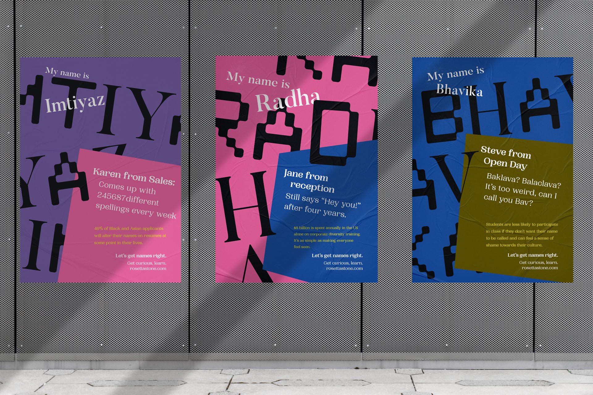
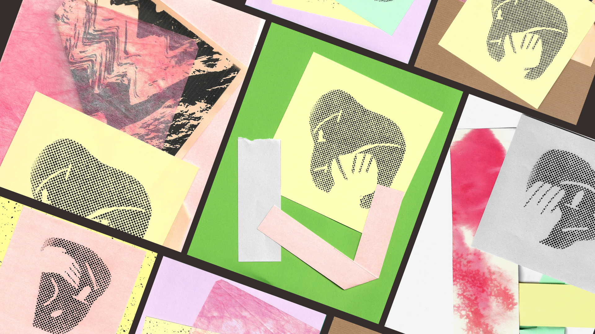
The whole campaign uses humour to diffuse tension on the topic. The copy is purposefully written to be tongue-in-cheek. Hand-made illustrations are printed in pastel tones and scanned back in to add personality to the visuals.
I also use clashing typographic styles, hoping to make the campaign informative and empathetic to encourage people to be more considerate and inclusive.


Not just posters.
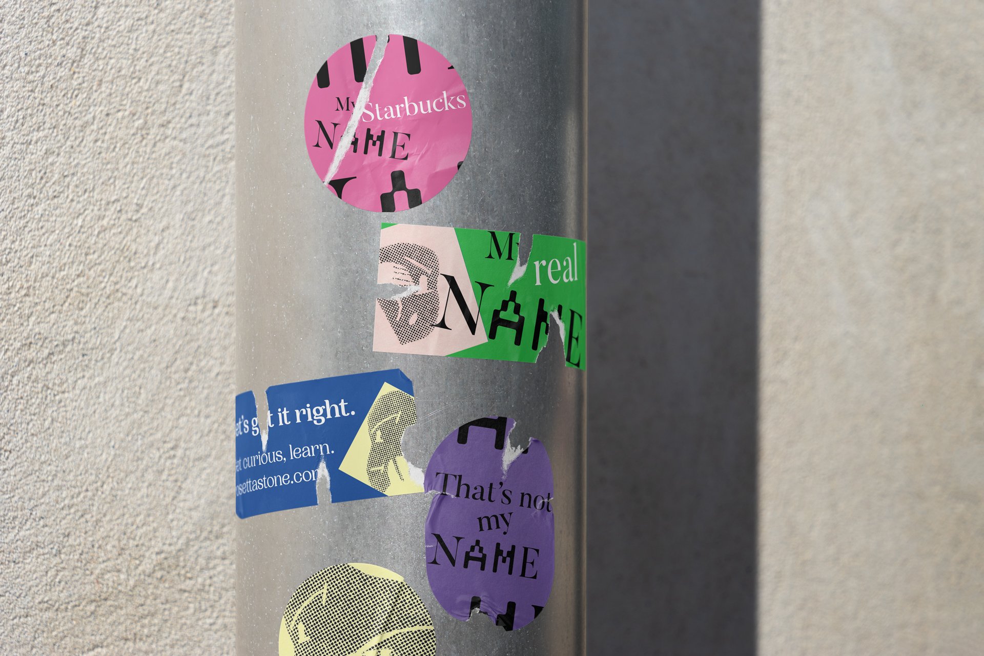
Ensuring that the campaign isn’t just about posters but having a well-rounded set of marketing materials to garner maximum attention.
This campaign is all about language and how we communicate, so the design uses several different fonts throughout. The choice to use a mixed typeface for the names in the campaign is to show the misconception of identity when names are mispronounced.
Name Simulator
I wanted to encourage empathy with ideas like the mispronunciation simulator. By inputting their names into the mispronunciation simulator, users who don't usually run into a language barrier can see what it's like to have their name misinterpreted. The many different ways they can be said are displayed, and there's also some historical insight into where the name originally came from. It's a smart, witty way to challenge a topic that touches on weighty issues.


