Magnetic Rock
Illustration concept, Illustration system, Merchandise design
Creative Director: Tim Aiken
⛔️ Problem
Magnetic Rock was a product incubator for cyber security tools which could be quite abstract & dry - it was difficult to add personality and fun into the brand and attract potential hires as well motivate current staff.
✅️ Solution
To create an illustration system of expressive characters that use the brand’s colour palette to create unique gradients that would make the company seem more personable and compelling.
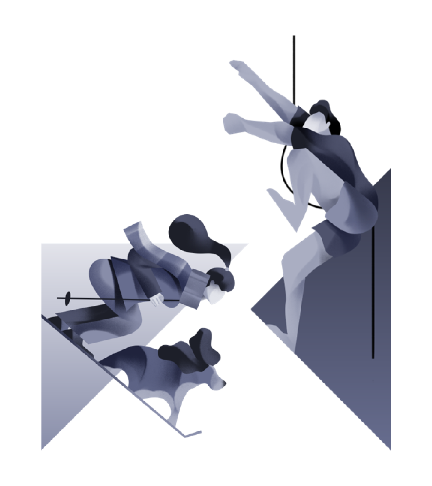

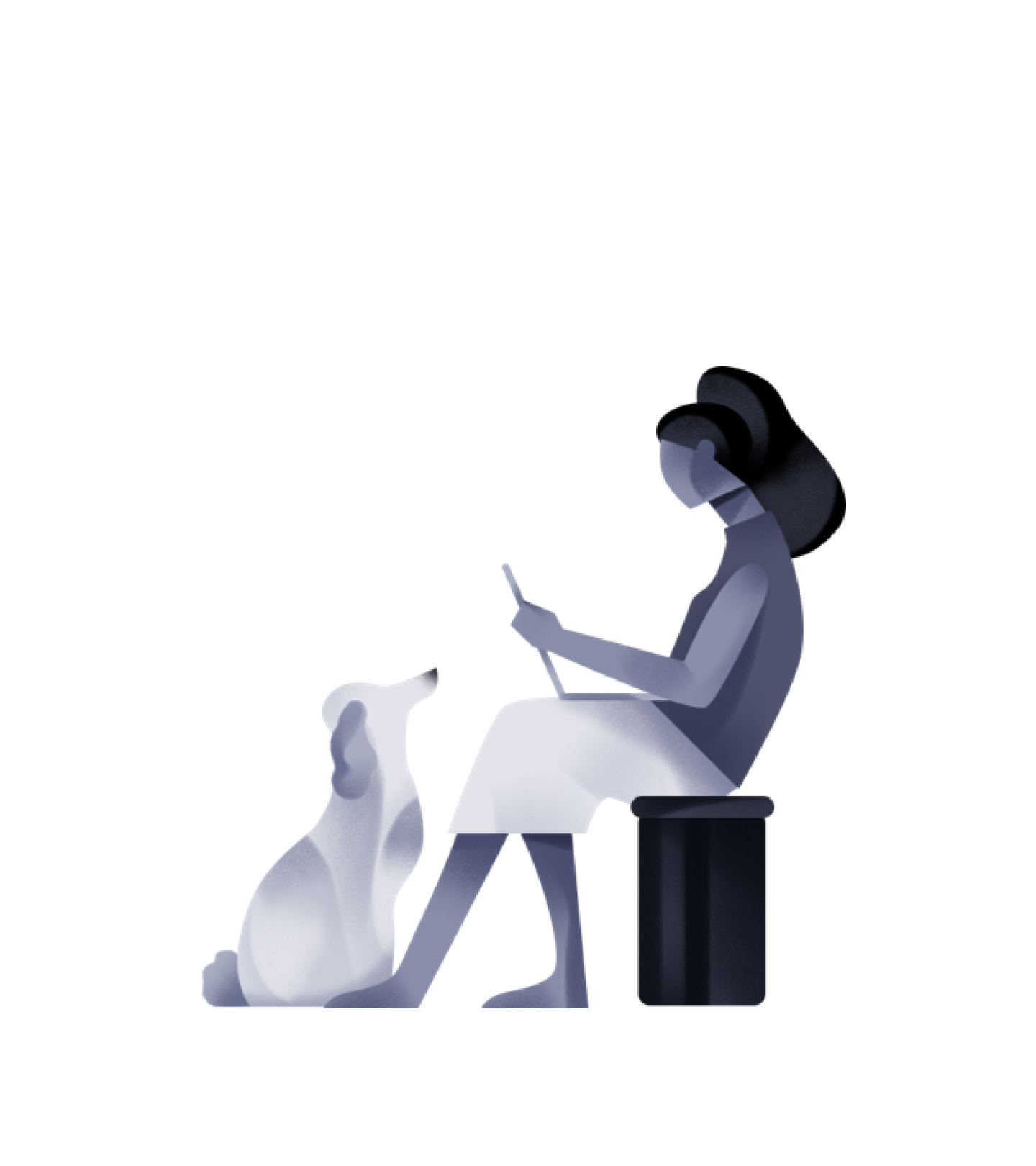
The action.
In order to make the brand come alive, I wanted the characters to reflect the company values of being “builders” and “innovators”. What does that mean? What kind of things are these characters doing?
So when it comes to 2D flat side view humans, the Egyptians were the first and the best perhaps. It just so happens they were always depicted “doing” and innovating” too.


The unfolding.
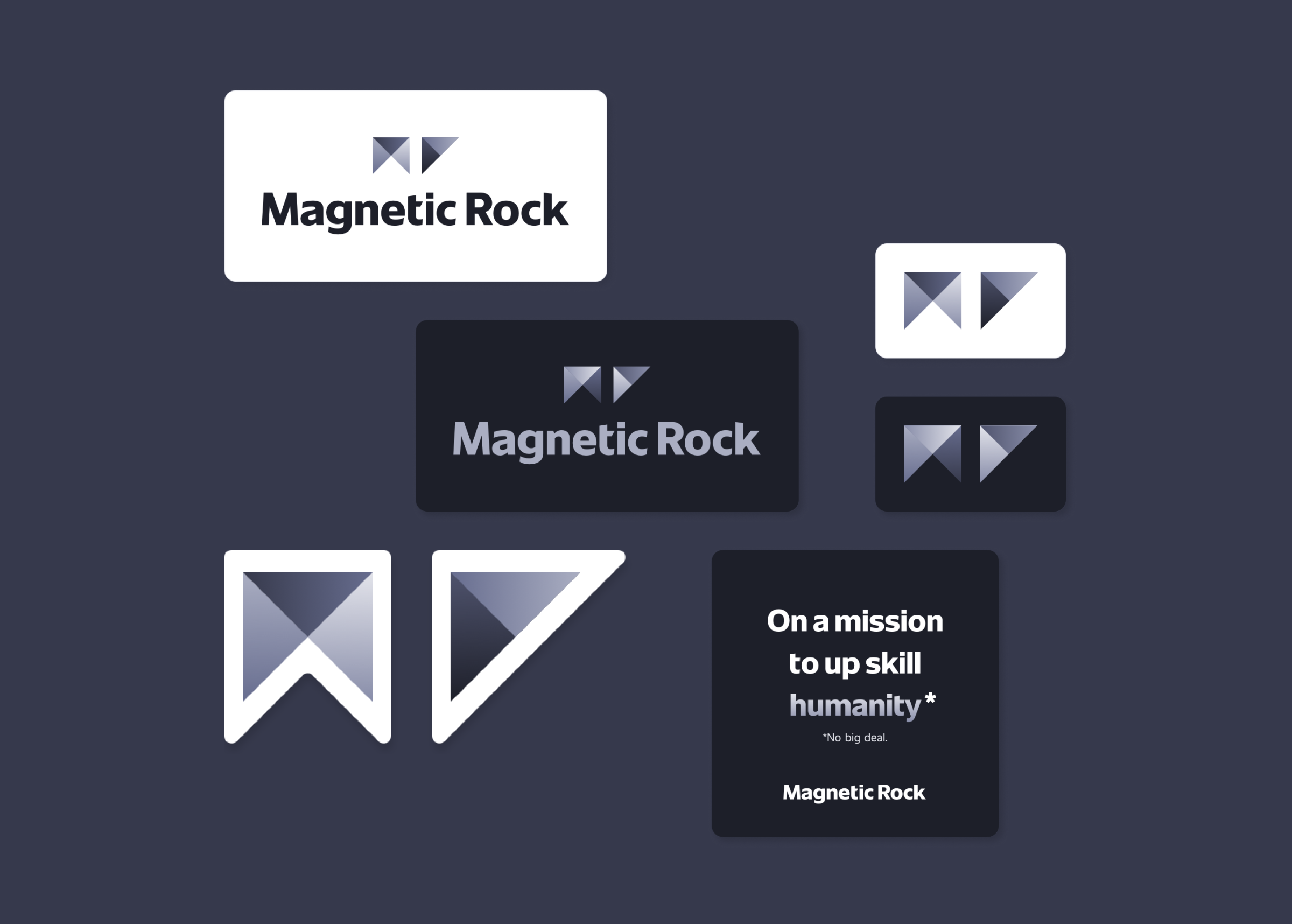
I also worked on the Magnetic Rock logo itself, I wanted to bring in the feel of movement with the illustrated gradients.
I also decided to use paper origami to play with some more dynamic movements with the MR word mark. From the following studies I made different versions of the logo.


Collection of nine abstract geometric shapes on a gray background, including circles, squares, triangles, and other polygons in shades of black, white, and gray.

Nine geometric shapes on a dark gray background, including a circle, square, stairs, house, plus sign, and triangles in black and white.

Abstract geometric shape with sharp edges in shades of gray and white on a dark background.

*The 3D renders are made by Anastasia Voj.